


Since its debut in 2019, Magic: The Gathering’s Secret Lair initiative has come a long way. Where once drops were relatively infrequent, now they’re coming in huge batches every few months. The visuals are getting bolder, too. Many modern Secret Lair designs are so out there that their card text, if it exists at all, is barely legible. These cards have become so prominent, in fact, that an MTG player was able to put together an “unreadable” Commander deck.
On one hand, the fact that such a feat is possible is testament to the advancements Secret Lair has made over the last six years. On the other, the fact that 100 MTG cards with questionable legibility exist is a possible cause for concern. With experimental art styles making the move into mainline sets, should players be worried that visuals are taking precedence over gameplay?
The “Unreadable” MTG Commander Deck

The unreadable Commander deck in question comes to us via battlegnomes, who shared the list on MTG deckbuilding site Moxfield. It’s a Shattergang Brothers list, but only for the sake of having Secret Lair art in the command zone. Mechanically, this deck is all over the place. Cohesive gameplay was clearly a secondary concern for battlegnomes.
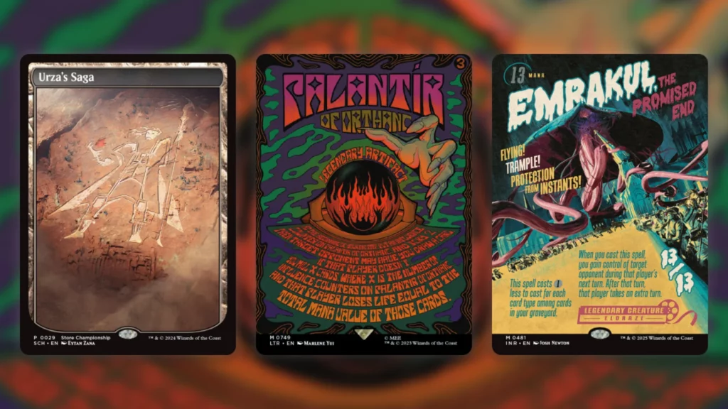
This makes a lot of sense, since a deck like this is really more of an art project than anything else. Several Secret Lair drops have been included in full, and while they have internal synergy they don’t play together particularly well. Wizard of Barge’s Goblin & Squabblin’ drop, of which Shattergang Brothers are part, shows up in its entirety. We also see Kathleen Neeley’s Prints of Darkness and Bene Rohlmann’s Poker Faces, to give two more examples.
What do these drops have in common? They’re all very difficult to read. Wizard of Barge’s Goblins are somewhat reasonable, but Neeley’s designs, Moldervine Reclamation in particular, really strain the eyes. Poker Faces doesn’t include card text at all, not even on the back. The rest of the drop is packed with more of the same, not all of it from just Secret Lair drops either.
Douglas Johnson shared the deck on Twitter a few days ago, and so far reception has been mixed. The original post was positive in tone, with Johnson claiming that the deck “kind of rules.” Others in the comments had similar thoughts, with mtg_sparks exclaiming “This is awesome!” Not everyone was so keen, mind you. Servant0fthorns chimed in with “This makes me physically ill,” while Robert Kadlec added “This is awful. I would ignore what they were doing the entire game and be surprised constantly.”
A Divisive Trend
This division regarding battlegnomes’ unreadable Commander deck isn’t surprising at all if you’ve been part of the MTG community over the past few years. Secret Lair has been controversial since its very inception, and has only grown more so over time.
At first this controversy came from the fact other IPs were being mixed in with Magic, but later the outrageous visual designs were the culprit. Look at the comments on any new Secret Lair release and you’ll quickly see what I mean. Regarding the recent Arcade Racers drop, for example, themiragechild noted that “These look really cool.” Sanmyaku88, on the other hand, said that they “hate the art.”
A lot of these criticisms are just down to personal taste. People naturally prefer certain styles over others, and Secret Lair was never intended as a product for everyone. Where things get dicier is when practicality comes into play. Aesthetics aside, not being able to read the cards you own is a pretty major issue in a game as complex as Magic.
That said, it’s not like unreadable cards are a new phenomenon in Magic. Textless promos have been around since 2005, where staples like Mana Leak and Fireball got the treatment. These are objectively worse in terms of readability than recent Secret Lair offerings, since they can’t actually be read at all. They did tend to be created only for very well-known cards, however, which mitigated the issue.
These cards were also fairly rare, whereas we’re seeing more and more borderline-illegible Secret Lairs with each passing year. This is a trend that worries me slightly, especially with how its creeping into non-Secret Lair products. The poster cards in Lord of the Rings and Innistrad Remastered definitely share this problem, and featured heavily in battlegnomes’ deck as a result.
No Escape?
We’re even starting to see a similar phenomenon in mainline sets. We’ve had Booster Fun, and the diverse range of Showcase frames it entails, for a while. In recent sets these have started to feel more and more like Secret Lair cards, however.
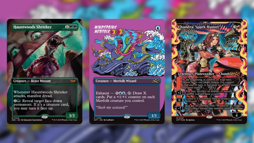
Just look at the Showcase lineup in Aetherdrift. Both Revved Up and Rude Riders feel like treatments right out of a Secret Lair drop. Rude Riders does in particular, with its block-color backgrounds and removal of the upper box that typically holds name and mana cost. Some of the now-established Japan Showcase cards aren’t great either, with Chandra, Spark Hunter, in particular, being tricky to read due to the art.
As of right now, this isn’t really a major problem. These more out-there Showcase styles still use regular text boxes for rules and stats, so they’re still very readable. That said, it’s easy to look at something like the Rude Riders treatment as an evolutionary half-step towards full-on Secret Lair cards in regular Boosters.
If that were the case, would that be an issue? Probably not in a mainline set, but possibly in a supplemental one. Generally alternate styles like this are optional for players to engage in. If you don’t like one, you can just grab a normal copy.
We saw with the anime art cards in Foundations Jumpstart that Wizards is willing to create new cards without these alternatives, however, so it may just be a matter of time until it’s Secret Lair style or bust. If that happens, the idea of an unreadable MTG Commander deck may go from fun joke to cold reality fast. This would be bad news for players, but it would give battlegnomes a plethora of new projects to work on.